Nov 30, 2012

Optimus Prime Pen on the moon base... Part16-9

16-9 To paint the Optimus Prime's head (continue)

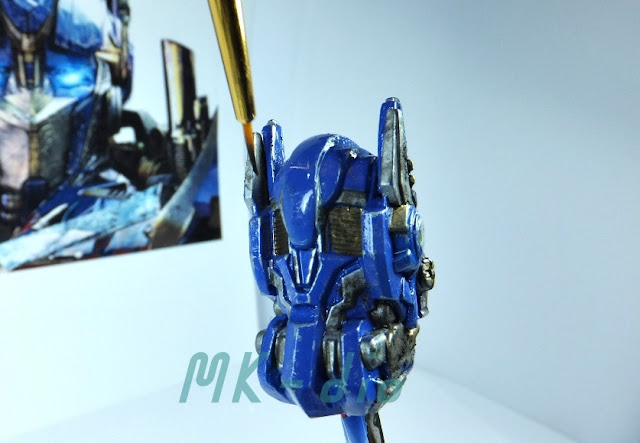
Previously, Prime remarked that the color of silver is a bit too dark. I agree with him. Then I'll make it a bit brighter by useing Thinner solvent silver color. what it should be... let's see.


          Once we are finished with all colors paint. We must finally coat it by top coat
                                         coat to hold colors for long life.

       An issue it the hole of laser pointer must be covered. The top coat may damage len
                                                of laser pointer inside.

                                                     I use the wood stick to plug it.


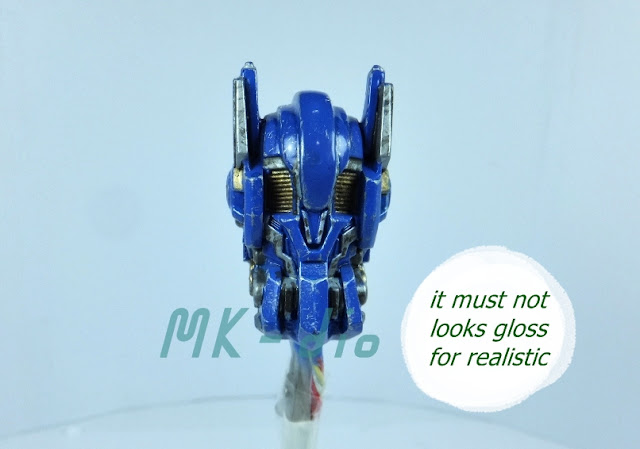
               If you use only "clear" type you will have the gloss that doesn't looks realistic.
                    So the Flat base some (1/4) mix with clear will be suitable to me.

               Spray it 4 rounds with thin layer each. Every rounds needs to heat this head
                                                  before & after spray.


Regularly, to make the weathering effect should make the brightest color at last.
That's all I'd like to say.

well, this is all about painting Optimus Prime head.
Next part (part 16-10) will be the fire frame paint onto pen. will you miss it?
hope you enjoy this.
Thanks for watching
Bye... ^^

Nov 29, 2012

Optimus Prime Pen on the moon base... Part16-8

16-8 To paint the Optimus Prime's head (continue)
Hi, this part will be about making the weathering mark on Blue color in order to make it not a new look.

 Metalic Flat type is recommended for makeing scratching mark around edges.
I selected Flat Aluminum.


                     on corners shoule be a bit bigger mark then edges for realistic effect.

                      Always imagine the possiblility of the scratches mark on each positons.


                                    Then apply the fine weathering mark technic.


                Next make the high light for Blue by mixing some white on the clear blue.


If you would like to have Prime font the same as photo, you can also use brush No.0,
but for me is still not small enough. I decided trim it more. 

 The proper color is a mixture of Flat Al & white.

Ready... go.. 

 Done..

 Pastel is good for grading down the sharp mark (weathering)

 Always move brush down. Take it easy.


Umm... what do you think? agree with Prime?
well, I'll decide more on next part (part16-9)
thanks for watching
Bye for now.